top of page
InfoWiz
Explore the digital world of social media with a captivating story.


Project Overview
What is InfoWiz?
A start-up company launched a freemium mobile app that users have been using. The business wants to evolve the feature set so they can monetize on a premium. Now they need to design an experience that will allow the users to subscribe and pay a monthly fee.

How did we get here?
Discover
2.1 Define- So what is the problem?
How can we help improve the signup flow for users to become premium members?
A flow designed to include ads free at a good fair price. The first step would be to construct a competitive analysis to understand what users should expect within this app.
2.1.1 Problem statement
User
-
Having to encounter ads while listening to the product
-
Limited amount of books and can’t read any books they desire
Business
-
How to get their consumers to continue using the app by signing up for the premium plan at a fair cost
-
The need to include features for the premium members that will be worth the price
Goals
-
The users want to accomplish reading or listening to audiobooks and podcasts without the distraction of ads
-
The product is to be able to read books and listen to audiobooks and podcasts with as much enjoyment as the user wants
2.2 Project Planning- Project Timeline with expections
2.2.1 Research Plan
The first task was to come up with a plan on how to get this project done but in the time box slot of 90 hours. This chart explains how to tackle each phase of the project.

What I learned
-
I had designed the user flows one step before sketching and wireframing when I just made my wireframes into a user flow
-
I wasn’t realistic about the time it took for me to get each phase done
-
I didn’t make the due dates I set for myself, but I still was able to get the project done in 90 hours
2.3 Competitive Analysis
2.3.1 Market Research
Second, to find apps with similar features I am looking to design for the app. The apps with the features best suited for this design are YouTube, Pandora, and Spotify. Audible and Barnes and Noble have the best layout for the type of design needed for this app.

For a full lighting demo and table analysis here
2.4 Research & Synthesize
2.4.1 Target audience
-
18-24 year-olds that are tech savvy
-
They want to register for a premium plan to avoid ads
-
They want to be able to use the app anywhere and while using multiple apps
(if listening to audiobooks or podcasts)
2.4.2 Jobs-to-be-done
Next, the Jobs-to-be-done needs to break down who is the target audience and what is their intended purpose for the app. Which I found out from the given prompt for this project.
Check out the Jobs-to-be-done report for more details
2.5 Types of heuristics
2.5.1 Representativeness
Involves making a decision by comparing the present situation to the most representative mental prototype.
Doing a deep competitive analysis of those apps helps give this project the type of familiarity needed for its users.
Ideate & Evaluate
3.1 Brainstorming Ideas
3.1.1 Putting it all together
Next came the part of putting all the good features from the apps and putting it together. It needs all the feature readers, and users who want to find information would be comfortable knowing how to use.
3.1.2 User Interviews
This user interview was done differently because the prompt was given to the target audience and their strengths. This user interview was conducted with only five people and they were asked questions about what they expect from an app for readers and to gain more information of any kind of knowledge.
Check out the script use for the interviews
3.2 Affinity Mapping
3.2.1 Understanding Users Goals
With all the insights gained from interviewing users, I organized the information and drew out common themes and patterns through an affinity mapping session.
The results gave me a clearer understanding of the narrative of the user's goals and the prevalent issues they face using these apps and websites.

3.3 User flow
3.3.1 Setting up user flows
The next thing to do is understand how the users are going to interact with every screen. This flow brakes down what each screen will have featured on it and all the intended purposes. This user flow is the sign-up process for a premium plan.
Key Takeaways
-
Ended up changing some screens and getting rid of others
-
I could incorporate more shortcuts to different screens than I mapped out in my user flows
-
Made sure the user understood how to navigate through the process by keeping the most important steps in the flow
3.3.2 Sign-up flow

3.3.3 Premium flow

3.4 Style Guide
3.4.1 Visual Design
With the kind of attributes of the users were given with a prompt, I figured it would be a good idea to look up what kind of colors are associated with them. I thought blue would be a good idea but I remembered Pandora's app is already blue so then it was time to think of a color that isn't well known with the brand and I chose purple as my primary color.
Then it was time to create a design system for this project.

Design
4.1 Low-Fi Wireframes
Now, it's time to put my ideas on screen and get into the lo-fi stage of the design process. Skipping the sketching part of designing the screens in lo-fi, made the screens look a lot cleaner and more detailed on how to make the necessary changes later.

4.2 Mid-Fidelity Design
4.2.1 Putting wireframes into perspective
Now, it's time to put my ideas on screen and get into the lo-fi stage of the design process. Skipping the sketching part of designing the screens in lo-fi, made the screens look a lot cleaner and more detailed on how to make the necessary changes later.

Checkout the low-fi prototype
4.2.2 Going through the changes
Showcasing the wireframes to help visualize what the flow will look like overall will show the user what to expect going into the hi-fi stage of the app. Before that happens we need to understand not only what changes will be made but also how the evolution from this stage will change greatly.
Before
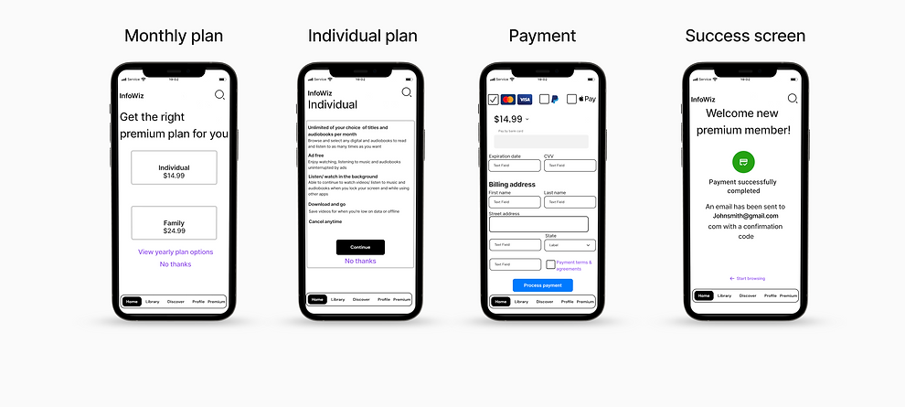
4.3 High-Fidelity Design
Despite my hi-fi screens staying consistent with my lo-fi screens, major changes were made to make the app look more like Audible and Barnes and Noble since this app is meant for both gaining information and entertainment.


Monthly Plan
Individual
Plan
Payment
Success screen
After
Monthly Plan
Individual
Plan
Payment
Success screen


Testing
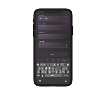
5.1.1 Usability Test Report
I did both of my rounds of testing in the hi-fi mode and the results were actually pretty good. The only real issue while testing was when it was time for the user to interact with the text fields I didn’t make the input fields individually interactive. I made the text field autofill which honestly would confuse me as well.
Issue 1:
The information would just pop in the fields without even using the keyboard feature
Solved:
Make the input fields highlighted to indicate the section is going to be filled
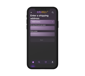
Issue 2:
They can't see some of the information when the keyboard is revealed
Solved:
Eliminated some info from the before screen so the keyboard can fit in the screen and the user can still see everything


Results
6.1 Product Impact
As a result of my product InFoWiz, I made an app where users are able to enjoy their reading material and gain more information by reading or watching videos. The people I interviewed recommended they would more likely use this in a school environment and tailor the app to high school and college students in the future.
Impact on user
-
Made an easy way for the consumer to sign up for a premium plan
-
They are able to get through the process pretty quickly
Impact on business
-
Have a price for the premium plan at a fair cost
-
The users are able to enjoy the content as much as they like without any limitations
Next Steps

bottom of page