top of page
NTfin
"The best way to predict the future is to create it" - Abraham Lincoln

Project overview

Discover
Project Overview
1.1 Define- So what is the problem?
How can we help improve the financial literacy of young adults?
Improving financial literacy in young adults requires a holistic approach. Implement dedicated financial education programs in schools, covering key topics. Develop user-friendly mobile apps for practical learning and collaborate with financial institutions for workshops. Encourage community events, peer learning, and gamification. Integrate financial literacy into workplace training and leverage social media for outreach. Advocate for government support and continuously evaluate programs for relevance. This multifaceted strategy aims to empower young adults with essential financial knowledge and skills.
1.1.1 Define- So what is the problem?
Problem statement
Around 70% of millennials say they can’t afford a home due to the hikes in interest rates and home prices. Young adults didn’t know what to do when buying a house but also they didn’t know how to budget their money in a good and effective way to better themselves.
Solution
What I need is to figure out a way for the users to figure out where to get the information they are looking for on wanting to save money and buy a house. The user also needs to be able to have a budgeting plan in place for future expenses
Goal
-
Get the user to learn how to budget their money
-
Give them the knowledge to know how to start a business
-
Understand the process of being a homeowner
Research
2.1.1 Primary Research- background research
Financial literacy, encompassing skills such as saving money and understanding spending limits, is deemed crucial, yet not universally possessed. According the research, only 57% of American adults exhibit financial literacy. The desire for enhanced personal finance education is evident among 73% of teenagers. The impact of financial illiteracy is reflected in Americans losing an average of $1,819 annually. Additionally, financial anxiety affects a substantial 77% of the population.
2.1.2 Capstone Research Plan
Many young adults lack essential knowledge about loans, from the application process to post-approval considerations. Recognizing the pivotal role of financial literacy, especially in significant life decisions like home purchases or starting a business, is crucial. This research aims to identify more accessible ways to provide young adults with the necessary financial literacy for life after college or high school, focusing on understanding their financial behaviors to enhance decision-making capabilities.
To find the in-depth research plan here
2.2 Types of heuristics
2.2.1 Availability
Making decisions based on how easy it is to bring something to mind. When someone is trying to make a decision, they might quickly remember several relevant examples. Since these are more readily available in someone's memory, they will likely judge these outcomes as being more common or frequently occurring.
Ideate & Evaluate
3.1 User interview plan
3.1.1 User interview plan
The first thing to do was come up with a plan on how I will interview each candidate. The objective was how can I help the user gain the knowledge and skills they need to become more financially literate.
Research Plan- The goal of this research is to find out how much knowledge these adults have on being financially literate and what they would like to learn to build on the information they already have.
Methodology- A screener that requires 20 candidates and conducts 5 user interviews with a script.
Define
From my interviews, I broke down what I learned and separated them into different subjects.
-
Empathy maps have a deep connection with each person
-
Affinity maps help break down the information I collected from each user and give me the ability to apply those problems later on
3.1.2 User screener
I made a screener to see who would best qualify for the interview process After the screener I called the top five people to see if they would participate in the interview.

3.1.3 Results from user interviews
From what I gathered from the five people I interviewed I noticed these top common things from everyone.
-
Majority of adults had to learn about a lot of basic things like credit scores, budgeting, and saving money in their adulthood
-
They made some bad financial decisions by racking up some huge debts
-
Without the knowledge of saving money, they couldn’t get what they need at a moment’s notice and put things off
3.2 Mapping
3.2.1Affinity Map
The next thing I had to do was divide what each person said into different group sections. I basically separated them in a way where I could find some similarities.

What I learned
-
The majority of the people I interviewed basically had the same basic problems like using credit cards in an irresponsible way and not knowing the importance of keeping a good credit score
-
Everyone wants to learn how to budget but says doesn't have time for it
-
A common theme of adults who didn’t seek secondary school tend to not enjoy their place of work leading them to want to become entrepreneurs to have a purpose while working
3.2.2 Empathy Map
Now that I had a feel for what everyone thinks about finances, I needed to understand what they go through on a day-by-day basis. I needed to put myself into their shoes by empathizing with the potential users.
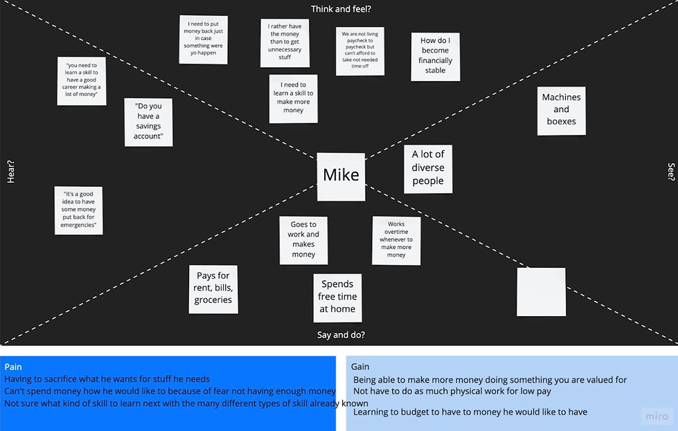
What I learned
-
People really struggle with what they want vs. what they need and they have to sacrifice when that isn’t fair
-
The people who didn’t go to school or learned much about finances are working jobs they don’t want to want but it pays the bills
-
That is forcing them to put learning financial things on hold which also affects their ability to learn and save on becoming an entrepreneur
3.3 User flows
3.3.1 Personal planning
Next, I had to answer what kind of scenarios how young adults will use my product. By having a map of how to tackle the user’s problems, I would later have a clear idea of where to place certain kinds of screens within the app. Taking all that in mind I was able to start creating red routes for how I want the user to navigate my application.

What I learned
-
That putting myself in the user’s shoes I had a more direct idea of where I hope the user goes step by step
-
A bit challenging because I had to come up with which screens the user is going to encounter and I had to think more about what to include in each route
3.3.2 Sitemap
In crafting wireframes, I appreciate how they effectively bring my envisioned screens to fruition. This process aids me in precisely delineating the user's journey towards their ultimate objective. Moreover, it serves as a valuable tool for communicating the intended functionality and purpose of each screen.

Key Takeaways from wireflow
-
I was able to see the routes I envisioned for my users and I didn’t like where I placed some screens so I made changes.
-
I also realized that I needed to add more screens for my routes to make sense so I had to spend some time coming up with more designs.
-
A bunch of the screens I have here I didn't include in my final design
-
Also, the final design didn't have this kind of wireflow
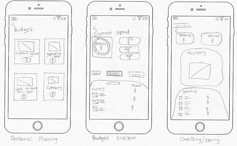
3.4 Sketches/ Guerrilla usability testing
3.4.1 Sketches
I had so many ideas on how I would like my product to look so I decided to put my ideas on paper and started drawing my sketches for my app. I then had to sketch the design I want each screen to look like.
3.4.2 Guerilla Usability Testing
With the those same drawing I was able to conduct a guerrilla usability test with the help of POP by Marvel. With the results from testing I learned that, I needed more screens, a clear and direct path to where I want the user to go, and more details on each screen.
To learn more about what I learned you can read my results here.
Key Takeaways from testing
-
I needed more sketches, I didn’t know that the more sketches I had the more the users will start understanding how the application worked
-
The users were very confused about how to get from one place to another
-
I tried to make it short cuts and that led to users not understanding the end goal of the product
3.4.3 Guerilla Usability Testing Feedback
Some of the memorable quotes I heard and paid attention to while watching the users was my first test as a UX designer. I learned that I need not just to create an app to get to a solution but to understand how we got to the problem in the first place and knit-pick small details people wouldn't think about.
“I would want to start my business plan after I came up with the brainstorming part of my business.”
-Shuan
"I noticed once I have done my steps to first start buying a house, I started to feel like I can understand how to become a real homeowner."
-Ayuoba
"I was confused on how to get to my plan I felt like the process was too short and, no offense, was cutting corners to get to the end goal"
-Steve
3.6 Style guide
3.4.1 Visual Design
Learning how to create a style guide was a bit hard but with the resources from Springboard, and YouTube at my fingertips, I then got started creating the style guide. I did have additional help with using the website Webaim.org to help figure out which colors were going to be visible. I decided to use blue as a primary color because this is a finance app and blue is associated with that kind of app.

Design
4.1 Lo-fidelity wireframes
4.1.1 Trials and errors
Doing wireframes for the first time was time-consuming because I didn't set a library. At this time I learned that I can't focus too much time on the small stuff when designing in the lo-fi stage. These were the final outcome in the lo-fi stage after making several changes.
Personal
Planning
Current
Spending
Spending
Tracker
Final
Results


Key Takeaways from Lo-fi
-
I didn't had a clear way for users to get to the Personal Planning screen
-
Users also couldn't come up with a plan for their budget once they were able to see their overview
-
My typography needed a lot of work because a bunch of the text weren't matching with other text on the screens
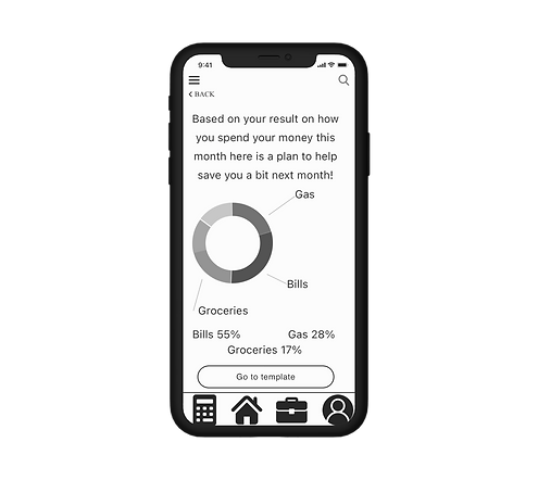
4.1.2 What should I do differently?
I ended up having to make major changes to my wireframes in the hi-fi stage. It also took me a really long time because I didn't have a library for my elements and I didn't set up my typography at the beginning so I had to go back to make those changes. I also had to eliminate a ton of unnecessary content on some screens.
4.1 Hi-fidelity wireframes
4.1.1 Trials and errors
I ended up having to make major changes to my wireframes in the hi-fi stage. It also took me a really long time because I didn't have a library for my elements and I didn't set up my typography at the beginning so I had to go back to make those changes. I also had to eliminate a ton of unnecessary content on some screens.


Key Takeaways from High-fidelity mockups
-
Some colors I originally thought for certain areas in the app didn’t look good so I made changes to those elements.
-
I decided to put well-known icons in my navigation bar because I want the user to have access to different sections with little to no effort.
-
If there is one thing I would change is more areas to have the user interact and type in the app.
To view my prototype you can go here.
5.1 Usability testing
5.1.1 First round
I needed to first come up with a test plan to help narrow down who I wanted to help me with my prototype. I then learned I still have some issues with my product that I didn’t stop to think about.
Issue 1:
Caught some misspelled words within the app so just to double-check check grammar
Solved:
I looked at the screens with fresh eyes and read each section. I also made my users aware about any errors to look out for.
Issue 1:
The confusion surrounding the phrase 'Create Plan' arises from its inconsistent placement across screens, leading users to divergent destinations within the application.
Solved:
consider standardizing the location of the 'Create Plan' option or employing context-specific labels to clearly delineate the distinct functionalities associated with each occurrence.
5.1.2 Second round
After making my iterations, I did a second round of usability testing. I still learned there is more I could’ve done to update my design decisions.
Issue 1:
The current limitation with the search bar impedes my ability to perform desired actions.
Solved:
I enhanced the functionality to enable seamless navigation to specific screens, providing users with a more efficient and intuitive experience on the website.
Issue 1:
The user expresses a preference for the ability to review available loan options prior to initiating the application process
Solved:
Implementing this feature would enhance transparency and empower users to make informed decisions about their loan choices, contributing to an improved user experience.
Issue 1:
The user prefers the flexibility to skip ahead to their desired page without the obligation to fill out extensive information.
Solved:
Offering an option for streamlined navigation would enhance user autonomy and efficiency, contributing to a more user-friendly experience on the platform.
Results
What did we find out?
6.1.1 Reflection
In my first UX/UI design project, while I faced challenges and identified areas where improvement was needed, the experience was invaluable in terms of learning. I appreciate the opportunity to reflect on the aspects that didn't meet expectations, as it has provided insights into areas of growth. Moving forward, I am eager to apply the lessons learned to refine my skills and enhance the quality of my future design endeavors.
6.1.2 SWOT Analysis

bottom of page