top of page
GalleryPal
Who can inhabit a place where the past and the present intersect?

Project Overview
What is GalleryPal?
GalleryPal is a company that wants to improve the in-person viewing experience for people at museums and galleries. In this hypothetical scenario, Gallery Pal brought me on board to help them with their long-term goal of creating a mobile app that would improve the in-person experience of viewing art in a museum or gallery.
So whats the issue?
Art museums and galleries want to increase customer satisfaction when viewing paintings, sculptures, and installations. The museums want to leverage the technology and they want to inform users in a more engaging and interactive way to view the artwork.
How can we fix it?
An iOS mobile app that uses image recognition technology to conveniently search any artwork that you are viewing in person in order to search for interactive audio information about the artwork and its artist in a story format by using videos.
What are the goals for this project?
-
To design an app to help increase the interaction of guests by using their phones to make learning more fun and engaging with paintings, sculptures, and installations
-
The end goal is for the guest to maintain the information they either read or listen to by taking a short quiz
Google Design Sprint
What is a Google design sprint?
“The sprint is a five-day process for answering critical business questions through design, prototyping, and testing ideas with customers. Developed at GV, it’s a “greatest hits” of business strategy, innovation, behavior science, design thinking, and more—packaged into a battle-tested process that any team can use.”
-Google Venture
Project Timeline

Day 1- Mapping
Tasks for the day
-
Understand the problem and the target user's pain points.
-
Start at the end by mapping possible user scenarios.
-
Pick the target event using How Might We questions.
1.1 Understanding the problem
Visitors leave the museum feeling frustrated because typical methods of teaching about the art such as group tours or reading labels next to corresponding artwork weren’t effective in providing a meaningful experience. Before I started anything I had to understand the different kinds of personas going to museums. I identified three different kinds of personas.
1.2 Different kinds of personas
-
Anna enjoys looking at art but feels like she is missing out on the full experience by not knowing any upfront information or context on the art.
-
Ryan doesn’t like group tours and enjoys viewing the art but also still listens in on the tours for information.
-
Dana prefers to learn more about the artist and their process and technique.
Next, I had to understand what kind of information tour guides talked about during their tours, and what the guest wants to gain after going to the museums and galleries.
-
Guests want to hear about any tragedy in the artist’s life, how they grew up, and the reasoning behind why they decided to become an artist in the first place
-
The tour guides typically provide the reasoning behind each art story like the technique and color or texture of the art piece
-
The tour guide’s goal for the guest is to have the guest go and view any or each artwork on their own and see if they can view it in a different sense to want to learn about the details within the art
From there, I defined my sprint question: Can we improve how guests experience art while looking at the piece in real life?
1.3 HMW Statements
I identified a few How Might We..? questions and sketched a few possible solutions.
-
HMW gives users concise yet compelling information on the artwork.
-
HMW introduce our users to the artwork that resonates with them.
-
How might we educate museum guests without being overwhelmed?
-
HMW allows users to effectively learn about the artwork without interrupting their viewing experience.
1.4 Affinity Mapping
The statement I chose to solve was that HMW allows users to effectively learn about the artwork without interrupting their viewing experience. I prioritize the greatest impact opportunity in improving the in-person viewing experience. Developing my final user map focused on designing a game users can play to collect points to get something from the museum’s gift shop.
Next was to map out the experience the user will likely go through and I used my personas to help picture this situation.


What I learned
-
How to identify the guests’ problem of not knowing anything about the art before they get to the museum.
-
By providing information within the app about the art piece and artist.
-
-
Mapping out the experience will make it easier to build the app to the user’s needs of understanding the art.
-
I know that I want the user to be able to snap a picture of the art they are looking at and be able to read, listen to, or watch a video about the story behind the art.
-
Day 2- Sketching
Tasks for the day
-
Lightning Demo (competitive analysis)
-
Crazy 8s, final sketch
2.1 Lightening Demo
With the suggestions of Jake Kapp of Google Venture, I had to see what other museum-like apps were doing well. Some apps were the American Natural Museum of History, Natural History Museum, Artly, and Smartify.
I liked the layout and camera scan feature of Smartify. The quiz feature of Artly I thought would be a great way to retain the information the user just heard or read. I thought with both features why not make it into a fun game both children and adults would enjoy.
.jpg)
2.2 Crazy 8's
After spending 8 minutes sketching as many screens as I could for my solution, I then figured out which three screens were my most critical.
-
The camera on the artwork captures the picture.
-
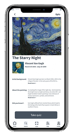
The recognized artwork with the information about it and the artist (at the time)
-
The congratulations screen let the user know they had collected points from the quiz.

I then realized the more important screen instead of the congratulations screen was the information screen.
What I learned
-
After doing a competitive analysis I was able to build an app with similar features users won’t get confused about
-
Crazy 8 exercise isn’t about making each screen look nice but to come up with what the ideal screen should look like
-
I was able to see how my app would start to look by implementing different features from each app I analyzed
-
My sketches should look messy. I didn’t finish my 8 screens for my crazy 8 exercises and I was too focused on small details.
Day 3- Storyboarding Solutions
Tasks for the day
-
Finalize design decision
-
Storyboard user flow
3.1 Storyboard
The storyboard of my user flow takes the user from scanning the art, the app recognizes the artwork, and the information will appear for the user to read or listen to, and finally take the quiz to collect points afterward.

What I learned
-
After finalizing what my app would look like, I was able to make a storyboard based on how I thought the user would interact with the app
Day 4- Prototyping solutions
Tasks for the day
-
Prototype design in a high-fidelity mockup
4.1 Prototyping sketches
This day I had to design my prototype and I wanted to use the layout of the navigation bar for the app Smartify and the recognition feature to help make my idea come to life.
Scan

Infomation

Quiz question

What I learned
-
This day I had to design my prototype and I wanted to use the layout of the navigation bar for the app Smartify and the recognition feature to help make my idea come to life
-
The information is there now it's time to make the app look more fun so I will add more pictures to the quiz questions


4.2 User flow map
I also provided a user flow map to help illustrate how to use the app to help show how to navigate through the app

Day 5- Testing

Tasks for the day
-
Test the prototype with 3 users
-
Validate to see if this will get users to interact with more art at museums and galleries.
-
Implement results to improve the prototype.
Overall I received positive feedback from my app. After testing it on four users all said that having the app in a game format to help retain the information helped with the quiz.
5.1 User testing
Did the participants struggle with any part of your prototype? What did they notice?
User 1- The loading screen after you scan the art. The next screen after the camera is just a stilled imaage of the previous screen so the user just stood there and waited for something to happen.
Solved- Just remove the screen to help with confusion.
User 2- She struggled most with where the scan icon was and what to do for the task itself.
Solved- To find the scan icon, she should check the toolbar or menu options for an icon that resembles a scanner or camera.
User 3- Not able to click on the "read more" option from the page with the art information.
Solved- Due to it being a design sprint I didn't have time to get into the details of the following screen I just focused on the main flow at the time. However, I did then make it an effort to include that page for the quiz intended purpose.
Key takeaways after testing
-
All my users like the game to collect points to help them want to interact with the art more.
-
The quiz did force them to retain the information they just read and apply it which they did so well.
-
Anyone can enjoy this app no matter their age.
-
The design doesn’t have to be perfect and it is supposed to be lean. I went over the 5 days after not confirming my test days and not having a schedule that matches theirs.
One thing I could’ve done differently would be doing guerilla usability testing and going to a museum to see if people would like the app.
Next Steps

bottom of page