Acceleration
Witness the collision of colors and ideas in a mesmerizing display of artistic expression.


Project Overview
About the company
To confidentially, I will not name the company nor the name of the CEO. So I will call the company “Acceleration” to keep it simple and similar to the actual name. Acceleration is a performance solution company. They focus on learning performance improvement, and actionable design. They design and develop fast-track learning and performance paths for entire jobs or talent roles. The resulting Acceleration Path takes people to full proficiency in a specific job or talent role in the shortest time while delivering measurable results.
"A huge thank you to all of you, Gregory, Nurcan, and Quenton for your interest, talent, time, effort, and care in this project. You pulled it together and comprehensively captured our UX needs in designing the 4 UI interfaces for Learners, Managers, Admins, and our internal Admin. I appreciate how quickly you responded to updates and changes and turned these around for our clients, consultant, and dev team to have the highest quality version in time for our meetings. You came up with great survey questions for client feedback and we did receive important feedback from our clients."
-CEO of Acceleration
Project Timeline

Discover
1.1 What's the problem?
There is a general view of user confusion around using the course online, which we can see from the metrics that are showing a decline in clients registering for the course. It pressured the company to adjust to reduce the financial consequences.
1.1.2 Goals
Reduce confusion and increase registration for the course.
1.1.3 Solution
The learners will be able to know where they are and be able to communicate to their managers and coaches where they are in the program. The managers and coaches will be able to see the progress of every learner and be able to sign off the employee to make sure they have a good comprehension of the material.
1.1.4 What users should expect
To streamline the LMS, we improved the login process, ensuring it's quick and seamless. Users start on the Acceleration website's home page, navigate to the "training" tab, and access the login screen. Upon logging in, they see their dashboard featuring daily tasks, a calendar, video lectures, articles, assignments, and a chat feature for communication with managers, admins, or coaches.
1.1.5 What are the roles?
Team project
-
Gregory Kimbrell(design lead) as UX Researcher
-
Quenton Juma(myself) as UX Designer
-
Nurcan Gumus as UI Designer
Research
2.1.1 Moodboard
Our first task was to create a mood board for the company. We needed to find the right imagery that would fit the feel of Acceleration and great UI inspiration to use for the prototype of the redesign.

2.1.2 Imagery
The imagery Inspiration for Acceleration focuses on helping people learn new job skills and improve their performance, it is important that the brand feel both professional and inspiring.
2.1.3 Ui inspiration
We decided that because the brand attributes are Trust, Belonging, Self-improvement, Caring, and Optimism, we have chosen examples of web designs that demonstrate professionalism and inspiration and explore themes similar to those we studied for Acceleration.
2.2.1 Competitive analysis
Next, I did a competitive analysis to see what other websites were doing well on their page and what improvements could be made to set Accleration’s website apart from them. Focusing on their top competitors: Aims Solutions, Ralph Kison, and Marcourt Communications Inc. Then with additional research I had to break the analysis into two parts. The first part was how websites structure their flows to get users to use their products and what the good and bad are along the way. The second part is to look up more LMSs and see how other websites incorporate their brand within the website.

Ideate
3.1.1 Sketches
I came up with the initial set of drawings. My goal was to draw something to demonstrate the dashboard with the daily activities with a description of what the learner needs to accomplish. The goal of the user is to be able to see a calendar view of what they should expect next.
Displaying the activity for the day with a quick description and a checkbox for the user to mark that they completed their daily task. Our design team decided to add more items to the left side of the dashboard and made the calendar function an optional view. Later on after a few revisions for the design, we went back to complete some updated sketches just in case we needed them.
Before

After

Design decisions
-
Added the calendar function for users to oversee the agenda for the current day and future dates
-
Instead of having a bunch of activities listed on each day, it is shortened to activity, definition, and a checkbox to mark when finished with the task
-
Added positive affirmation after for users to feel good about accomplishments
3.2.1 User Flow
In this user flow, we had the user start at the redesigned version of the home screen, which led them to either log in to their dashboard or create an account for the kind of dashboard they needed. Then the flow ends with his intended dashboard which in this case would be the learner dashboard.
I started the flow with the idea that the user would be able to log in or sign up through the website and then register the suitable LMS they needed. The only thing is that this flow only focuses on the route designation but doesn’t explain the depth of how the user will get there. The later design has them see the home screen first and then log in because Acceleration will handle the part where they would have to create an account so all they will have to do is log in.

Design
4.1.1 From paper to wireframe
After making the Prototype I noticed that I lacked a lot of details about how exactly the dashboard would work. I didn’t have any details explaining what is the purpose of the calendar, doesn’t explain why having a checkbox is important for the user, and where each element will be placed. So I had to make updated changes from the first wireframe to an updated version of that wireframe.

Design decisions
-
Need to show where each area of the screen leads to the next place
-
Had to show what the screen looks like when a user clicked on their daily task
-
Change the location of the CTA button on the screen with a detailed description
4.1.2 Reduce time to task
The key changes we noticed for this wireframe were “go straight to the goods, no intermediate screens, give them exactly what they’re looking for.” The CEO informed us that the admin of her team would already have all the credentials ready for the client. All we need to do is design the flow to jump straight to the dashboard. So with that in mind, the design is now centered on the dashboard and it’s functions.

Design decisions
-
Top left with Learner Name, settings, etc.
-
Adding a settings gear icon to let the learner know this is where the change stuff happens
-
Added Start Date (actual calendar date)
-
Path Popup – renamed to Path View
-
Added a chat feature
Added "Customize a Path" (to bottom) opens to "Path View" – this is for experienced staff or transfer-ins from other departments, this allows them to mark complete certain activities prior to beginning a path or during, requires mgr/coach approval when this feature is used.
Activity Window
Added "Mark Complete"–predesignated for mgmt approval (by admin) another Sign-off box would shown
4.1.3 Tracking the progress
For this wireframe, we just changed the positioning of some features. Also, we did make some small upgrades like the ability to see what is in the path view, and got rid of the weight percentages.
Giving a more in-depth view of what is in each path view shows the learner a more detailed breakdown of what to expect in each path. We felt like as designers that the weight percentages didn’t matter as much so instead we changed to to stars for the user to mark as complete. The changes made in this wireframe were on the top left with the “Learner Name,” settings, we added a settings gear icon to let them know this is where the change stuff happens, the “Start Date” (actual calendar date) is important to define for cohorts.

Design decisions
-
Messages Popup- to indicate messages are being sent/received
-
Feedback Pop up- for the user to get notified when the manager/admin has provided feedback on the topic
-
Rename Path Notes to Path Overview- to avoid confusion among learners
-
Path View for Learners – showing completion status when done with a task
4.2.1High Fidelity Mockups
The reason why we created hi-fi mockups was to bring the wireframes to life. We used the company’s colors as the core palette to design the website. We went through a handful of changes when designing the hi-fi mockups and we had to make sure we kept one rule in the back of mind. Keep it simple that was the motto we had to follow this entire process.
The hi-fi mockups start pretty basic with the same design as the first wireframe and sketch. As the project progressed it was only natural that we add more detailed features to key UI elements. For example the addition of the chat feature, path view overlook, and calendar functions. In the end, we came up with a mockup that met everyone’s expectations including the CEO’s.

Design decisions
Added Export Final Report to Settings Pane
Removed the Search Bar from Path View and Custom Path- it didn't make any sense having it there
Align Path Overview to Path Overview Pop-Up
Next Steps
The next steps I would take as a designer to help enhance the product would create a prototype of the learner dashboard and test it on its users. I would conduct a usability test to see if the product would help decrease confusion on the learner dashboard.
What I need to do
-
Can the user fully go through the dashboard with any problems
-
If the user is stuck with any material are they able to easily communicate with their manager in a timely fashion
-
How will the user use the calendar or plan on how they will complete their training
If I can answer those questions I would know that this product was a success in reducing confusion with the resignation of the LMS. I also know that with that goal in mind, it would most likely increase the company’s revenue with their clients too.
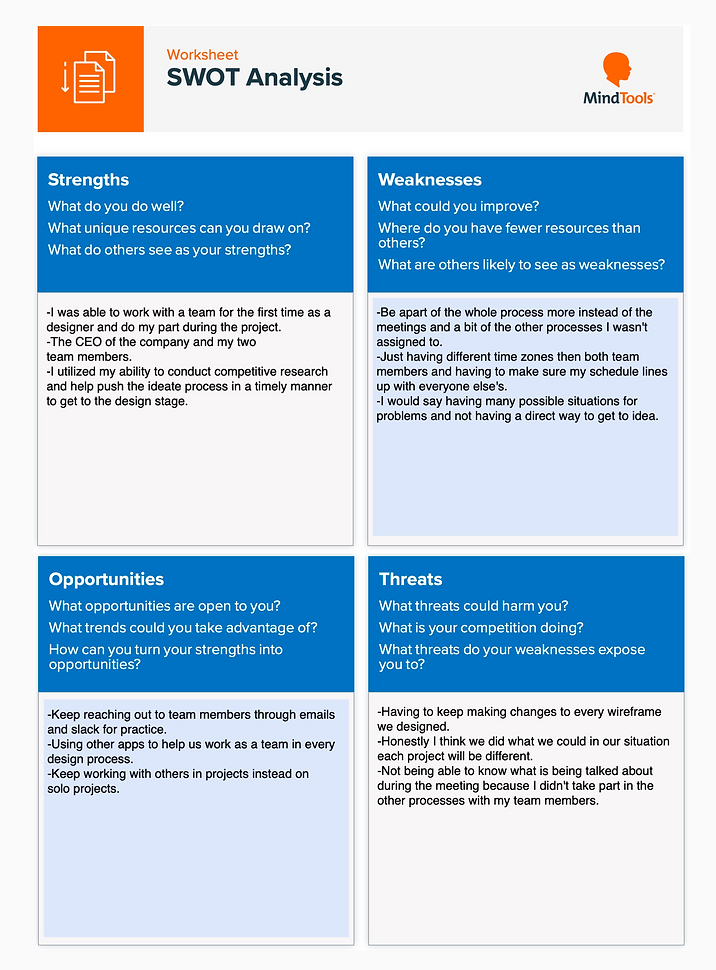
SWOT Analysis