top of page


Key Takeaways
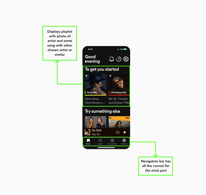
I decided to really focus on how their home screen looked like because I did think the design could be a great way for the user to want to keep exploring the app.
-
Dark feature- utilizing it well with the right bright primary colors
-
Layout- The way the app gives options on choosing their music and artist with the artist face and genre
-
Pricing- give multiple options with competive prices

bottom of page